Affiliate links: Type & Paper may earn a commission if you buy through these Creative Fabrica links. Product previews are credited to their designers.
The serif & sans workshop
A name with character.
Details that stay clear.
A label usually needs more than an attractive name. The product description, size and practical details need their own place in the hierarchy. A serif and a sans serif give you two different voices without relying on a handwritten accent.
These three starting points include two products described as coordinated serif-and-sans combinations, plus our suggested pairing of two separate fonts. The original specimens show the actual lettering. Use the layout suggestions as ideas to try with your own wording after downloading the fonts.
Compare the three pairingsChoose by your project
Which relationship suits the product?
01 / A composed name and supporting line
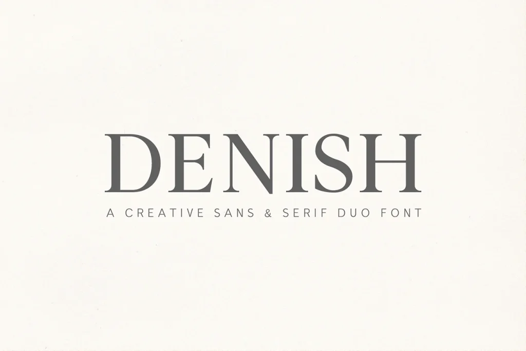
Denish
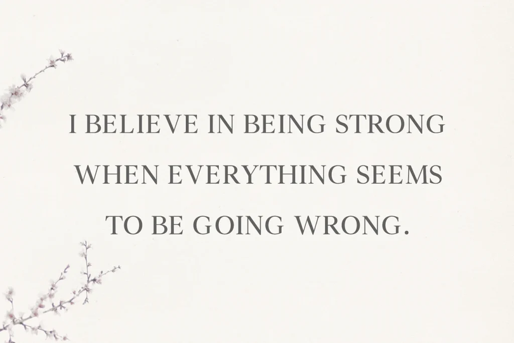
Denish offers the classic route: a clear contrast between serif and sans serif styles, with several weights shown in the listing. It gives you a useful starting point for a name, a product description and a small supporting line without assembling unrelated display faces.
For a label idea, let the serif carry the brand name and compare a simpler companion for the product details. Keep the alignment consistent and use size before adding another weight. On a small front label, a clear name and one calm descriptive line can be enough to establish the relationship.
- Use it for
- A classic small-brand label, restrained stationery and a name with a clear supporting description.
- Keep in mind
- A coordinated family still needs a real-size check. Inspect the weights available on the current listing, then choose a supporting style that remains comfortable to read on your smallest use.

02 / A name with more weight
Caturra Vintage
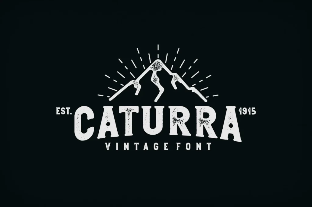
Caturra Vintage gives the pairing a much heavier, more vintage character. The original character chart shows rounded, regular and vintage directions with clean and textured versions, so it is worth comparing the actual alphabets as well as the finished badge-style cover.
We would explore it for a coffee label, an outdoor goods name or a substantial product heading. Let the strongest face carry the short name and use a quieter companion for one small line below it. Keep the hierarchy simple before adding a border, an icon or extra distressing.
- Use it for
- Vintage product labels, substantial badge-style names and a short heading with a compact supporting line.
- Keep in mind
- Texture and heavy shapes can become unclear when reduced. Compare a clean variant on the smallest label and use the character chart to judge the lettering separately from the cover illustration.

03 / Choose the two roles independently
Serifa + Montilla
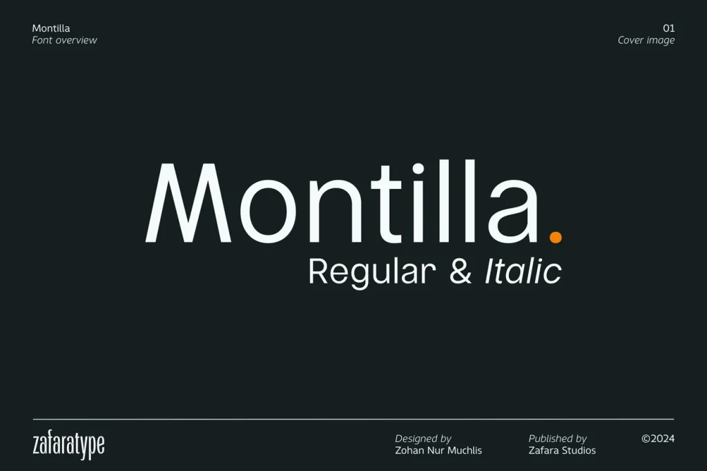
Serifa and Montilla are separate products. We would explore the fine, high-contrast serif for a larger name and the plainer sans serif for the information beneath it. The specimens are shown separately so the contrast in the actual letter shapes stays clear.
Try this direction for a spacious studio label or a minimal product card. Keep Serifa large enough for its fine strokes to remain visible, then give Montilla a smaller supporting role. If the label is very small, make the practical information lead and reserve the delicate name treatment for a larger version.
- Use it for
- A minimal studio identity, a spacious product card and a label with a delicate name above clear information.
- Keep in mind
- This is a pairing suggestion, not a bundled product or a tested layout. Review both listings separately and try your exact words before choosing the final size, weight and spacing.
Make the choice useful
Build a hierarchy before adding a third font.
Before downloading: inspect both voices on Creative Fabrica.
Open the linked product page and check which styles and weights it includes. Use “Try this font” where a working text field is available; otherwise inspect the specimen and character chart. For a suggested pairing of separate fonts, review both product listings and their current download options.
After downloading: make one complete label.
Install the fonts and build the label in your design application with the actual brand name, product description and size. Give each face one clear role. Compare the result in a single colour before adding photography, texture or a decorative frame.
Check a line of real information.
Do not judge the supporting font only from a two-word specimen. Add a full product line and inspect its punctuation and numbers at the printed size. If both faces compete, change their sizes or weights before introducing another display style.
The images are the designers’ original product previews. Project and styling suggestions are our editorial ideas. Check the original listing for the available characters, current offer and license.
Back to the shortlist