
Affiliate links: Fontedits may earn a commission if you buy through these Creative Fabrica links. Product previews are credited to their designers.
A handwritten start to the year
Make a short greeting feel personal.
A New Year card does not need many words. “Happy New Year”, a family name or a short note can carry the design when the lettering has the right character. These four fonts move from flowing calligraphy to soft signature shapes, brush-style strokes and playful hand-lettered capitals.
They are not all connected scripts. The final pick offers a bolder, informal alternative for a family greeting. Two products have Christmas in their names, but we are considering their letterforms for New Year designs; check the exact words, year and characters you need on the original product page.
The images below are authentic designer previews. They show how each product has been presented, while our card ideas are suggestions for your own layout. Choose one short greeting first, then decide whether the supporting name and date should match it or use a quieter face.
Compare the four font stylesChoose your lettering direction
Four fonts to compare.
A flowing personal greeting
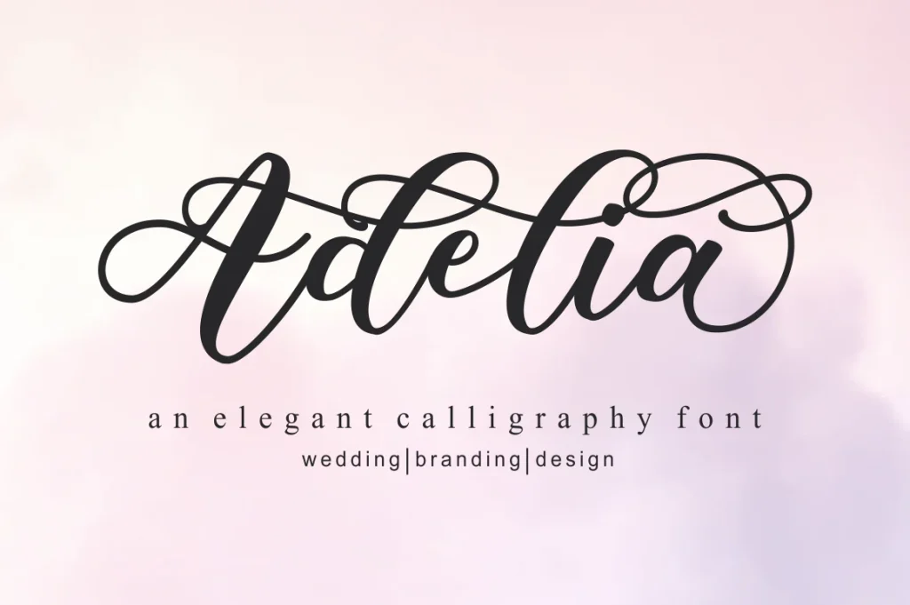
Adelia
Adelia has an expansive, calligraphic movement, with large loops and a contrast between heavier strokes and fine connecting lines. It suits a card where one phrase is the main event. The generous letterforms can make a restrained design feel expressive without adding much decoration.
Give the greeting room on both sides and keep small supporting information away from the longest strokes. A simple name or year below the script can make the composition feel finished. Use the original preview as a guide to the font’s character rather than expecting every word to have the same flourish.
- Use it for
- A personal New Year greeting, a short card-front message or a celebratory family note.
- Keep in mind
- Check the actual phrase and available alternates before choosing. Elaborate strokes can collide with nearby lines, and small print may weaken the finest details.

A softer signature mood
Christmas Signature
Christmas Signature offers a soft, friendly direction with rounded connected letters. It feels more informal than a sharply structured display serif and can suit a short greeting that is meant to feel warm and personal.
Place the main phrase in a clear central area, then use a restrained supporting font for a longer message. A small seasonal accent can work beside it, but the lettering should remain the focal point. Compare the spacing in your real phrase, especially where a capital joins smaller letters.
- Use it for
- A warm New Year card, a short thank-you message or a personal holiday note.
- Keep in mind
- The product name does not restrict your design to Christmas, but it also does not confirm every numeral or language character. Check those details in the listing.

An energetic brush greeting
New Year
New Year has a livelier slant and a looser rhythm than the smoother scripts above. The strokes and open details in the original preview give it a more spontaneous character. It can be useful when the card should feel celebratory rather than formal.
Use a short phrase on a generous field of colour and let the baseline movement provide the energy. Keep the smaller message straight and simple beneath it. If you add a border or starburst, position it outside the strokes so the greeting remains easy to recognise at a glance.
- Use it for
- A lively “Happy New Year” card, a digital greeting or a short party thank-you.
- Keep in mind
- The visible stroke detail can lose clarity when reduced. Review the actual text at the final size and avoid placing it over a busy photograph.

Playful hand-lettered capitals
Our Christmas
Our Christmas brings a different kind of handwritten personality: rounded, irregular capitals with plenty of weight. It is a useful alternative if flowing calligraphy feels too formal for the card. The uneven character can suit a cheerful family greeting or a bright, simple design.
Try a compact two-line headline with a small family name underneath. Because the letters already have a strong personality, keep the remaining shapes simple. A plain background and one accent colour can help the message read clearly without turning the card into a crowded illustration.
- Use it for
- A playful New Year card, a family greeting or a short celebratory message.
- Keep in mind
- This is a bold display direction, not a connected signature script. Check the actual capital and lowercase options on the product page before planning the final wording.
Make the design useful
Let the greeting breathe.
Set the words you will actually send.
A font name is only a specimen. In your design app, inspect your greeting, family name, punctuation and year together. Watch repeated letters and long strokes that can touch the next line.
Separate the greeting from the message.
A decorative phrase can sit on the front while the longer note uses simpler type inside. This keeps the personal character without forcing every sentence into ornate lettering.
Check a small version as well.
A card may also be sent as a phone image. Review that smaller version and print a paper proof if you will mail it. Keep a clear margin around the outer strokes so cropping does not cut them off.
The images are the designers’ original product previews. Project and styling suggestions are our editorial ideas. Check the original listing for available characters, current offers and licensing.
Back to the shortlist