
Affiliate links: Type & Paper may earn a commission if you buy through these Creative Fabrica links. Product previews are credited to their designers.
The wedding table edit
A personal name.
A very small canvas.
A place card is read in a different way from an invitation. Guests may be standing beside the table, looking past glassware or finding their seat in soft evening light. The name needs to feel personal and stay recognisable.
These four choices cover distinct approaches to a small name line. The original previews show the lettering; our place-card ideas explain how we would use it. Test the longest guest name as well as a short one before choosing the card size and type treatment.
Compare the four name stylesChoose by your project
Which voice suits the table?

01 / Informal & approachable
Simple Handwritten
Simple Handwritten uses separate, slightly uneven letters with a relaxed rhythm. It is a useful direction when you want a personal-looking name without the dense joins or long swashes of connected calligraphy.
We would try a single name line on a plain folded card, with a small table number or short note underneath. Keep the name dark and comfortably large. The informal lettering already brings character, so a highly decorative border is unlikely to be necessary on such a small piece.
- Use it for
- Relaxed garden-wedding place cards, informal name tags and a short personal greeting.
- Keep in mind
- The strokes are light. Check a physical proof in ordinary lighting and avoid making the name pale simply because a delicate colour suits the table decorations.

02 / More height in a small space
Simple Wedding
Simple Wedding by Inermedia STUDIO has tall, narrow forms and an informal quality. It offers a different proportion when a guest name needs to occupy less width without becoming a connected script.
Explore it for longer names on a small rectangular card. Compare one line with a deliberate two-line version, keeping a surname intact where possible. Let the name be the focal element and use a quiet supporting font for the table number instead of making every piece of text equally tall.
- Use it for
- Longer guest names, slim rectangular place cards and clean informal table stationery.
- Keep in mind
- Narrow does not automatically mean readable at any size. Check repeated upright strokes, accents and the exact spelling before using a very small name line.

03 / Let the name be the flourish
Beauty Reflections
Beauty Reflections brings sweeping capitals and more elaborate strokes to the table. It is the more formal direction in this shortlist, suitable for exploring a name treatment that acts as the card’s main decorative detail.
Give the name generous margins and compare the regular and custom styles shown on the listing. We would keep any table number small and plain below it. A flourish should remain clear of the fold, trim and neighbouring letters; a beautiful capital loses its effect if it is crowded against the edge.
- Use it for
- Formal place cards, a prominent short name and coordinated decorative table headings.
- Keep in mind
- Long names can become wide quickly. Check the complete name and choose a quieter alternate or another line if the calligraphy no longer fits comfortably.
04 / Coordinate the name and number
Boho Wedding Duo
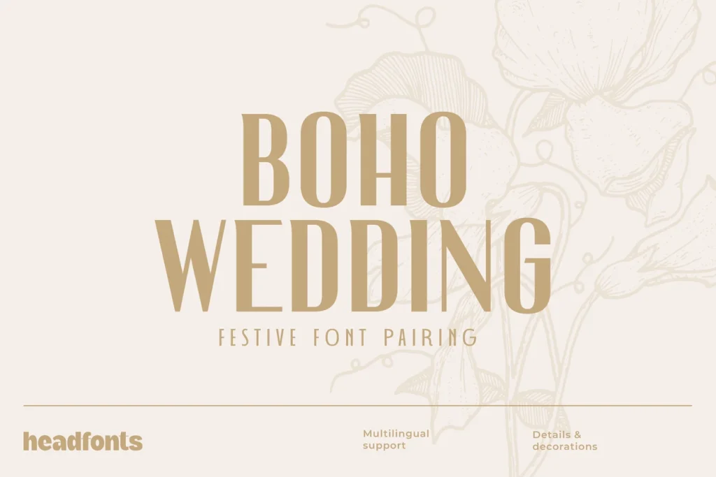
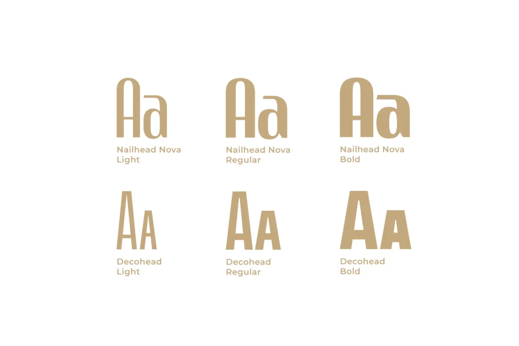
Boho Wedding Duo offers two structured lettering directions: Nailhead Nova and Decohead, with light, regular and bold versions shown in the specimen. This gives you another route if flowing calligraphy does not suit the celebration.
Use the more distinctive face for the name and compare the other for a table number or short heading. Repeat those roles on a menu or small table sign to connect the pieces. Start with one weight in each role before adding further variations to the suite.
- Use it for
- Coordinated table stationery, structured name cards and a wedding with a geometric or decorative theme.
- Keep in mind
- The light styles need the same small-size check as a fine script. Choose the version that keeps the guest’s name clear, rather than using a thin weight purely to match the sample cover.
Make the choice useful
Design for the longest name on the list.
Before downloading: preview more than one guest name.
Open the font’s Creative Fabrica page using its button above. In “Try this font”, enter a short name, a long name and any accented spelling where that field is available. If there is no text input, inspect the specimen and glyph chart for the needed characters.
After downloading: make the smallest card first.
Install the font and create a real-size card in your design application. Include the fold, margins and any table number. Print it, stand beside the table and see whether the name is easy to recognise without picking the card up.
Keep the whole guest list consistent.
Use the same alignment and a small number of size rules across the cards. If a few names are much longer, give them an extra line or choose a wider card. Shrinking only those guests’ names to a tiny size makes the set feel uneven and harder to use.
The images are the designers’ original product previews. Project and styling suggestions are our editorial ideas. Check the original listing for the available characters, current offer and license.
Back to the shortlist