
Affiliate links: Fontedits may earn a commission if you buy through these Creative Fabrica links. Product previews are credited to their designers.

New Year’s Eve / dinner and drinks
A festive heading. An easy-to-read menu.
A New Year menu has two jobs: set the mood of the table and help guests choose something to eat or drink. A dramatic typeface can handle the first job, but course names, ingredients and useful details need a calmer rhythm. This shortlist includes both decorative headings and a simpler option for the information underneath.
The four fonts below are individual products, not a bundled menu kit. We have grouped them by the role their letterforms could play in a dinner menu or cocktail list. Pairing and layout ideas are editorial suggestions; the images are the designers’ original previews.
Start with the actual menu text before choosing a format. A three-course dinner card has different spacing needs from a long drinks list. Write the longest dish name, any options and the information guests need, then decide how much room the title can reasonably occupy.
Compare the four font stylesChoose your lettering direction
Four fonts to compare.
The after-dark headline
The Deco Noir
The Deco Noir brings a clear evening atmosphere through the contrast between substantial vertical strokes and finer geometric details. Its broad shapes work particularly well when the headline is short. A restrained menu can use those shapes as its main decorative feature.
Try “Midnight Menu” above a simple list of courses, or place a small event date above a larger “Cocktails”. Leave a generous gap before the first item. The font’s visual complexity is a reason to give it a clear role, not to set every ingredient in it.
- Use it for
- A menu title, cocktail-list heading or a short course divider on a spacious card.
- Keep in mind
- Fine strokes can become weak in a small or low-contrast print. Proof the heading at its intended size and choose a readable supporting face for long descriptions.

Light geometric elegance
Bellerose Pro Light
Bellerose Pro Light has a quieter presence. Its slender forms and open curves can suit a light, uncluttered dinner menu where the paper and spacing do much of the work. It offers a different direction from a heavy black-and-gold party poster.
Use it for a generous title or a small number of clearly separated course labels. On an ivory card, a dark ink colour will keep those light shapes visible. If the text includes several lines of ingredients, compare a stronger supporting face before committing to the whole menu in one weight.
- Use it for
- An airy dinner-menu title, a small table sign or a short celebratory heading.
- Keep in mind
- Light lettering needs sufficient contrast. Review a real print under the lighting you expect at the table, rather than judging only on a bright screen.

An ornamental dinner title
Regency Serif
Regency Serif introduces a more ornamental character. Its curled details can give a formal dinner menu an invitation-like feel, especially when the title is allowed to stand alone. It is the most decorative serif direction in this particular shortlist.
Place the heading above a simple divider and arrange the courses in a calm vertical sequence. Repeat the same small supporting style for each course so readers can scan the card. Extra flourishes around every dish will compete with the font’s own decorative shapes.
- Use it for
- A formal New Year dinner title, a celebratory table card or a short dessert heading.
- Keep in mind
- Check how the exact title looks in the available character set. Keep important menu information in clearer text if the decorative details interfere with quick reading.
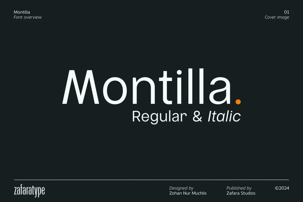
The readable supporting voice
Montilla
Montilla gives this shortlist a practical supporting option. The original preview shows clean sans-serif forms and regular and italic styling. Its simpler shapes offer a way to separate the event’s decorative heading from the information people need to read comfortably.
Try it for dish names and short descriptions beneath a display title, then compare the result at the size you intend to print. Use spacing and a clear size difference to separate course, dish and description. An italic can provide gentle emphasis without adding another decorative headline face.
- Use it for
- Dish names, concise ingredient lines, drinks descriptions and other menu details.
- Keep in mind
- This is a separate font product, not a companion file included with the other picks. Confirm the available styles and any accents or symbols required by your menu.
Make the design useful
Design around what guests need to read.
Build a clear order.
Keep the event title, course heading, dish name and description visually distinct. You do not need a new font for every level: consistent size, weight and spacing can do most of the organising.
Leave room for the longest item.
Lay out the actual names and descriptions before decorating the card. If a line wraps awkwardly, change the layout rather than making all the type tiny. Keep useful dietary or ingredient information clear and easy to find.
Print a proof before the full set.
Check a sample at the intended paper size and under table lighting. Test dark text on a light background first; a fine gold or pale heading may look attractive on screen but lose definition when printed.
The images are the designers’ original product previews. Project and styling suggestions are our editorial ideas. Check the original listing for available characters, current offers and licensing.
Back to the shortlist