Affiliate links: Type & Paper may earn a commission if you buy through these Creative Fabrica links. Product previews are credited to their designers.

The wedding stationery shortlist
Start with
your two names.
The right wedding font is the one that suits your names as well as your celebration. A long surname, an accent or an unusual capital can change the result more than the colour of the envelope.
This shortlist offers five different starting points: elaborate calligraphy, a bold script, a coordinated script-and-sans duo, a decorative serif and a finer modern serif. Use one to lead the invitation, then keep the practical details easy to find.
Find your invitation styleChoose by your project
How should the names feel?
01 / Let the names be the ornament
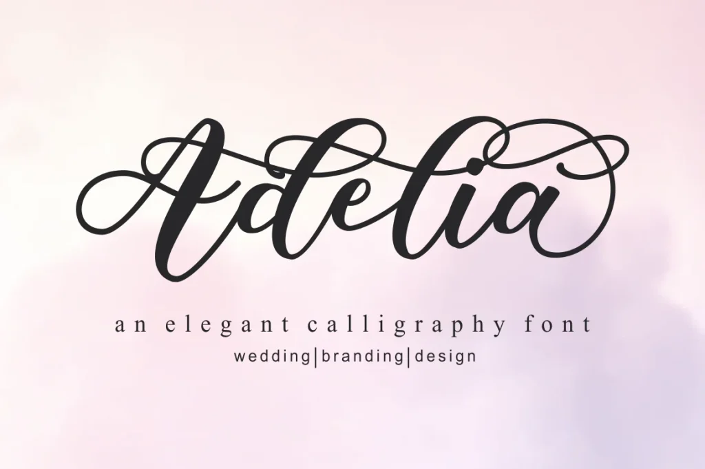
Adelia
Adelia has sweeping capitals, substantial downstrokes and fine connecting lines. The loops turn a short name into the main decorative element, making this a natural direction for an invitation with generous empty space.
Try the two names on separate lines before trying to fit them across the full width. Keep the ampersand small and the date in a plain supporting style. A floral border may work, but it should leave clear space around the long strokes rather than tangling with them.
- Use it for
- Romantic name lines, save-the-date headings and a short greeting on a thank-you card.
- Keep in mind
- Swashes can collide with letters on the next line. Preview both complete names together, including accents and capitals, before setting the line spacing.

02 / Warm & expressive
The Bohemian Duo
The Bohemian’s name example gives the handwriting a fuller, more emphatic shape. Its broad loops and long horizontal strokes feel comfortable with the loose floral illustration shown in the original preview.
We would begin with the name line and one small supporting line above it. Choose one flourish as the focal detail, then leave the venue and response information undecorated. This gives the invitation a personal voice without requiring every line to look handwritten.
- Use it for
- Floral invitations, garden celebrations and a prominent name on a welcome card.
- Keep in mind
- A flourish that works for the sample surname may not suit yours. Inspect the available initial and ending forms rather than assuming the cover’s exact composition will appear automatically.

03 / A ready starting system
Enchanted Bride
Enchanted Bride pairs a handwritten script with a bolder sans style. The contrast gives you a useful starting system: the script can carry the names, while the other face gives a short heading more structure.
The designer’s rehearsal-dinner example is a good reminder that a wedding suite includes more than the invitation. Choose consistent roles and repeat them across a menu, a welcome sign and a small card. You can change the size and colour without introducing another decorative font each time.
- Use it for
- A coordinated stationery suite, rehearsal-dinner cards and welcoming script headings.
- Keep in mind
- A bold supporting face is useful for headings, but it still needs a small-size check for longer information. Keep the address and response instructions comfortably readable.

04 / Character without connected script
Regency Serif
Regency Serif brings curved terminals and an old-fashioned, storybook character to the names. It offers a romantic route for couples who prefer distinct letter shapes to a fully connected calligraphic word.
Try a centred name line with generous margins, a small date beneath and very little added ornament. This can suit a bookish or heritage-inspired celebration. Let the decorative forms be the main detail; another ornate face for the venue would blur the hierarchy.
- Use it for
- Book-inspired invitations, classic name headings and short ceremony-programme titles.
- Keep in mind
- The unusual forms are part of the appeal. Ask someone unfamiliar with your names to read a proof so you can judge clarity without relying on memory.

05 / A quieter editorial mood
Serifa
Serifa is the finer, more restrained direction in this group. The original cover uses large, delicate serif lettering; on an invitation, that points towards a simple name line and an uncluttered arrangement rather than a decorative frame.
Explore it with cream paper, dark ink and a small block of supporting information. Give the names enough size for the thin strokes to remain visible. If you want a handwritten accent, keep it to a brief note instead of setting all the event details in a second display style.
- Use it for
- Modern minimalist invitations, editorial name headings and understated stationery.
- Keep in mind
- Fine strokes can lose definition on textured stock or at small sizes. Ask the printer to check a proof in your chosen production method before ordering the full suite.
Make the choice useful
Proof the invitation, not just the names.
Before downloading: preview both names on Creative Fabrica.
Use the font’s “See” button above to open its Creative Fabrica listing. Enter both names in the “Try this font” field where available, including accents and punctuation. Otherwise inspect the specimen and glyph chart for those characters. This preview helps you choose a font before building the stationery.
Check every character you need.
After downloading and installing the font, build one complete invitation in your design application. Include the names, date, time, venue, address and response details. Space the sections before adding more typefaces, and check how the decorative name line shares the page with the practical information.
Make a physical proof.
Print the card at its intended size and read it in ordinary light. Fine lines and pale colours deserve particular attention. The designer’s mockup shows a visual direction; your printer can assess how the final artwork will reproduce on the actual paper.
The images are the designers’ original product previews. Project and styling suggestions are our editorial ideas. Check the original listing for the available characters, current offer and license.
Back to the shortlist