Affiliate links: Type & Paper may earn a commission if you buy through these Creative Fabrica links. Product previews are credited to their designers.
The pairing workshop
One font leads.
The other adds a note.
A serif and a handwritten face work best when they have different jobs. Let one carry the main statement, then use the other for a short personal accent. Giving both the same size and the same amount of text usually makes them compete.
Here are three starting points: two products sold as coordinated duos, plus our suggested combination of two separate fonts. Compare the original specimens, choose the relationship that suits your project, then try the layout ideas below with your own words.
Compare the three pairingsChoose by your project
Pick the relationship before the colours.

01 / Clear contrast
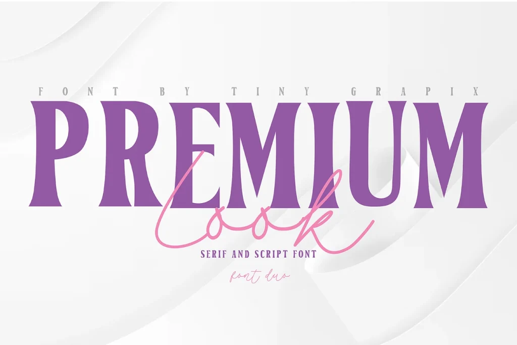
Premium Look Duo
Premium Look pairs a substantial serif with a lighter, flowing script. The clear difference in weight makes the relationship easy to understand: the serif supplies the main statement and the script adds a smaller personal line.
For a gift-card idea, put the occasion in the serif and a short “with love” below in the script. For a boutique label, reverse the order of importance only if the handwritten name is genuinely the focal point. Keep the weight difference visible rather than enlarging the script until both styles compete.
- Use it for
- A dressed-up card, a short product label or an invitation with one personal accent.
- Keep in mind
- The thin script needs adequate contrast. Keep it off busy photography and check that it remains visible when the final image or card is reduced.


02 / A more informal relationship
Second Mark Duo
Second Mark’s original cover places a serif heading beside a looser handwritten line, making the second voice feel like a note added to the page. The contrast is in the manner of writing as well as the weight.
Try the serif for the main name or heading and reserve the handwriting for a brief message beneath it. On a small thank-you card, “Thank you” could lead while a handwritten “for being here” supplies the personal detail. A generous gap between the two voices helps the handwriting look intentional rather than squeezed into the leftover space.
- Use it for
- Thank-you cards, personal stationery and an editorial label with a handwritten accent.
- Keep in mind
- A loose handwritten line can become hard to read when it is long. Keep it brief and let a simpler text style handle instructions, addresses or a full paragraph.

03 / Choose each role separately
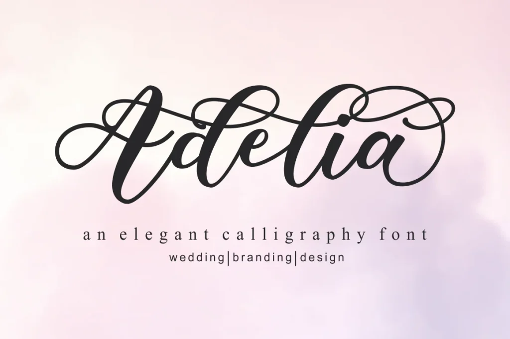
Signer + Adelia
Signer and Adelia are separate products, rather than a designer-supplied duo. We would explore them together when a serif heading needs a more elaborate personal name beneath it. The two original specimens are shown separately so you can judge the actual shapes.
A wedding card offers a useful test: use Signer for a short occasion heading and Adelia for the couple’s names. Give the calligraphy enough space for its long strokes. If both lines feel equally decorative, reduce the serif heading or choose a quieter treatment rather than adding another font.
- Use it for
- An invitation or keepsake card with a structured heading and a calligraphic name line.
- Keep in mind
- This is a pairing idea, not a tested bundled system. Check both fonts with your exact words and review the two product listings separately. A duo purchase does not include these two fonts together.
Make the choice useful
A simple pairing exercise.
Before downloading: preview the words on Creative Fabrica.
Open each font’s Creative Fabrica listing using its “See” button above. In “Try this font”, enter the heading or name where text input is available. For two separate fonts, check each product page. If the field is absent, inspect the specimen and glyph chart. The actual paired layout is a later step in your design application.
Compare the visible size, not just the number.
After downloading and installing the fonts, make a small layout in your design application. Give one face the main heading and the other a short accent. Adjust their visible heights and weights until one clearly leads, leaving enough line spacing for script capitals and descending strokes.
Choose a duo or two separate fonts deliberately.
A coordinated duo is a convenient starting point, but it still needs a layout test. When combining separate products, check the styles and characters in each listing. Try your exact words in the original product previews before downloading, then check the finished composition in your design application.
The images are the designers’ original product previews. Project and styling suggestions are our editorial ideas. Check the original listing for the available characters, current offer and license.
Back to the shortlist