
Affiliate links: Fontedits may earn a commission if you buy through these Creative Fabrica links. Product previews are credited to their designers.

New Year’s Eve / retro party lettering
Give midnight a little movement.
A disco invitation needs to feel like an evening out before anyone reads the venue. A rounded script can suggest a relaxed dance floor; a weighty slab serif can give the same party the presence of a concert poster. These four retro fonts offer different ways to build that first impression.
Our shortlist is about lettering for your New Year’s Eve headline. The original previews show the designers’ own styling; colour, shadows, photographs and decorative backgrounds are not necessarily included with the font. Use the previews to compare letterforms, then check each product listing for the exact files and characters before choosing.
For a 2027 party, start with one short line such as “Midnight Disco” and keep the year, address and start time in a simpler supporting face. The recommendations below describe layouts you can make in your design app; they are not downloadable invitation templates.
Compare the four font stylesChoose your lettering direction
Four fonts to compare.
Rounded dance-floor script
Groovy Retro
Groovy Retro makes a short title feel full and buoyant. Its thick, connected letters and round turns suit a friendly house party or a warm, colourful disco theme. The specimen’s stacked colours are useful inspiration for a palette, while the letter shapes remain the reason to choose it.
Try it across the centre of a square invitation, with a small year above and the essential party details below. Give the final letters room to finish; pushing the word against a border makes its flowing shape feel cramped. A plain background will usually support it better than a busy photograph.
- Use it for
- “Midnight Disco”, a dance-floor sign or a short social invitation headline.
- Keep in mind
- Preview the actual title and numerals in the font before buying. Reproducing the preview’s colour or shadow treatment may require extra design work.

Warm seventies lettering
Retro Vintage
Retro Vintage has the rounded weight that works well with cream, burnt orange and a dark accent. Compared with a restrained invitation script, its broad connected strokes make a more casual statement. This is a useful direction when the party should feel welcoming rather than formal.
Build a two-line headline around the words that matter most. A large “New Year” with a smaller “Disco Party” can be easier to arrange than one long sentence. Keep the venue and RSVP line outside that decorative block so guests can find them quickly on a phone.
- Use it for
- A seventies-inspired New Year invitation, party flyer or drinks-table heading.
- Keep in mind
- The designer’s preview uses layered colour and shadow. Treat those as styling references, not a promise that an effect will appear automatically.

Vintage curves with structure
Retroleta
Retroleta gives the shortlist a more structured vintage direction. The curved, substantial forms in its preview have a different rhythm from the connected scripts above. It can carry a short title while leaving room for a more orderly date and location underneath.
Use a simple frame or an arch to organise the composition. A small star on either side of the year can be enough decoration; many competing ornaments will weaken the letter shapes. If the invitation includes a dress code, set that line in the supporting face instead of squeezing it into the headline.
- Use it for
- A vintage-style New Year poster, a welcome sign or a compact party title.
- Keep in mind
- Inspect the exact spelling and punctuation you need. Decorative display forms should be tested at the final size, especially when the design becomes a small feed image.
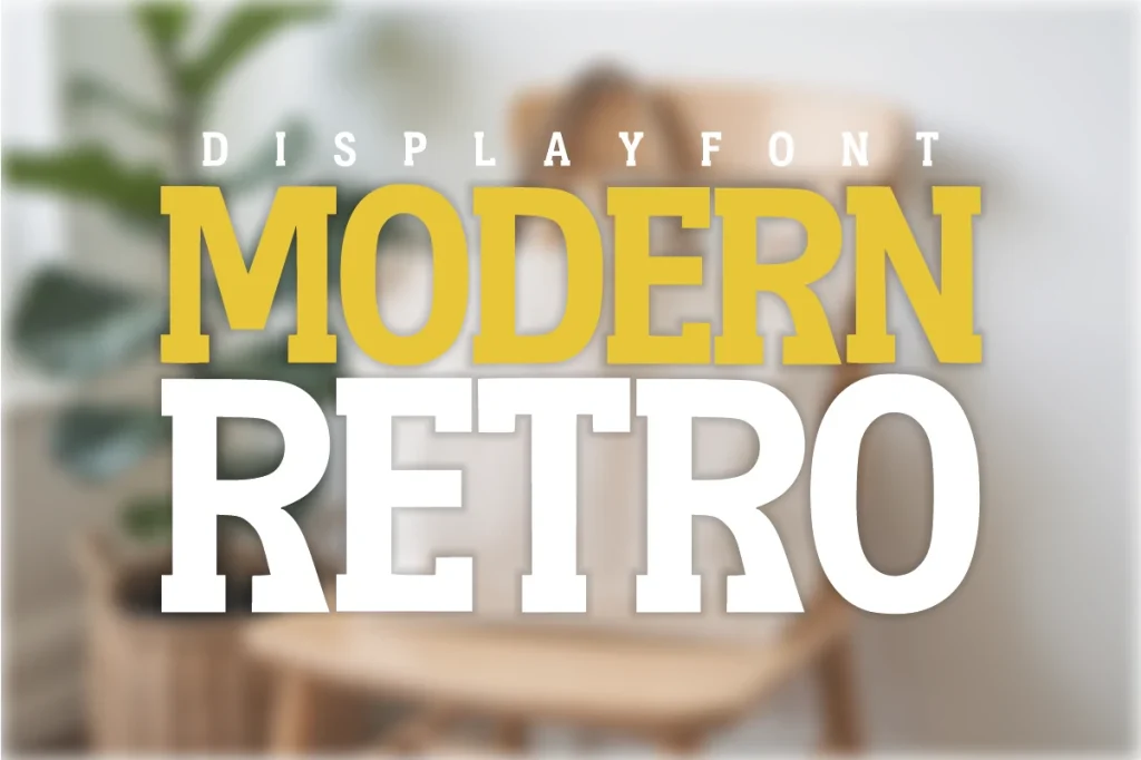
A bold poster statement
Modern Retro
Modern Retro is the firmest option here. Its broad strokes and block-like serifs give it a clear poster character, with less movement than the scripts. That makes it a useful choice for a direct headline such as “Disco Night” when the rest of the artwork already contains plenty of colour.
Let the title occupy a generous part of the page and keep the supporting copy short. A narrow line of party details can sit beneath it, but avoid shrinking those details just to preserve a dramatic headline. The invitation still has to communicate where and when to arrive.
- Use it for
- A large party poster, a strong two-line invitation or a bold midnight sign.
- Keep in mind
- A heavy headline can overpower a small format. Check the composition at phone size and reduce the number of decorative elements before reducing the essential information.
Make the design useful
Make the whole invitation work.
Choose one headline personality.
Use one of these fonts as the main voice. Combining several equally decorative faces on a small invitation makes it harder to see the event name. Keep the address, time and RSVP details in one quiet supporting typeface.
Check the year as carefully as the words.
Set “2027” in the actual font or choose a separate, compatible numeral style. Do not assume that a beautiful word specimen guarantees the numbers or special characters you need. Check the character preview on the product page.
Test both the poster and the phone view.
A party design may become a printed sign, a message attachment and a social post. Review each size separately. Keep thin details away from busy images and leave enough clear space around the final headline.
The images are the designers’ original product previews. Project and styling suggestions are our editorial ideas. Check the original listing for available characters, current offers and licensing.
Back to the shortlist