Affiliate links: Type & Paper may earn a commission if you buy through these Creative Fabrica links. Product previews are credited to their designers.
The photographer’s name
A personal signature
that still reads clearly.
A photographer’s name has two very different jobs. On a business card it can be the main event; in the corner of an image it has to stay readable without pulling attention from the photograph. Choosing a handwritten font means balancing those two uses, not simply finding the longest flourish.
This shortlist compares four distinct directions using the designers’ own product previews. Start with the exact name you will use, including a double surname or an awkward capital pair. The font is a starting point for your identity: the photo backgrounds, tag mockups and decorative layouts shown below are presentation examples from the listings.
Find a signature directionChoose by your project
How should your name look?
01 / A flowing name
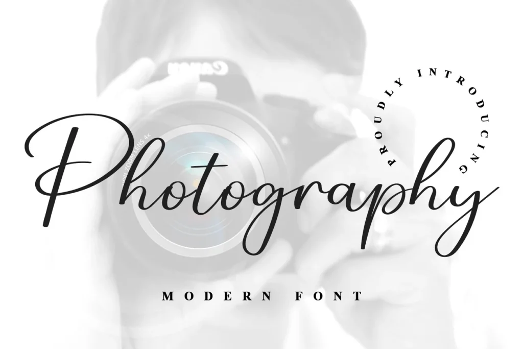
Photography Font
Photography Font by ABBAsalam has the familiar sweep of a handwritten studio name. The cover’s large opening capital and long connecting rhythm create a polished direction for a photographer who wants a personal name to take the lead. There is enough movement to make a short line feel considered without needing a separate emblem.
Try your full name rather than the word Photography from the specimen. A different opening letter can change the balance substantially, and two long words may become very wide. Once installed, consider a separate, smaller line for Photography or Studio in a quiet supporting font instead of asking the script to carry every word in the identity.
- Use it for
- Personal-name logos, album cover signatures and spacious website headings.
- Keep in mind
- Broad capitals and long tails need room. Check the complete name before deciding how small it can appear on a photograph.
02 / A fine calligraphic mark
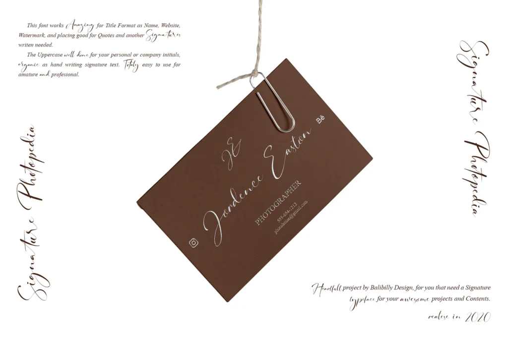
Signature Photopedia
Signature Photopedia takes a more delicate route. In the designer’s stationery preview, the lettering sits lightly across the composition, with fine strokes and a relaxed change of height. Consider this direction for wedding and portrait work when you want the identity to feel intimate and understated.
The listing describes alternate glyphs and ligatures, so examine those options if the default letter connections do not suit your name. They are choices to make in compatible software, not a promise that every typed name will look like the cover. Fine lettering is particularly sensitive to scale: a treatment that works on an album may need a simpler companion for small image corners.
- Use it for
- Wedding photography stationery, album inscriptions and delicate personal branding.
- Keep in mind
- Avoid making fine strokes both tiny and very faint. Check the actual exported image at its display size.

03 / A more prominent signature
Signature by Black line
This Signature has a more upright, substantial handwritten rhythm than the fine calligraphy above. The large capital S and lively ascenders give the cover an energetic, personal feel. It is worth comparing when an extremely delicate signature disappears beside the strong shapes or colours in your work.
Keep the name itself fairly simple and let the lettering supply the expression. If your surname has several tall letters, inspect their spacing together before adding swashes or stretching the mark. A supporting line can sit below the signature with enough space that it reads as a separate piece of information rather than an underline made of text.
- Use it for
- Confident personal names, portrait studio cards and prominent image signatures.
- Keep in mind
- The designer is Black line; several unrelated fonts share the name Signature. Use this article’s link to reach the exact listing shown.

04 / A casual handwritten alternative
Watermark
Watermark offers an alternative to a sweeping connected signature. The designer’s quote preview shows light, informal handwriting with a more separated rhythm. This can suit a family or lifestyle photographer whose brand should feel conversational, particularly if ornate calligraphy feels too formal for the photographs.
The long quote on the cover demonstrates a mood rather than a finished logo system. For an identity, begin with a much shorter name or studio title and test its particular letter shapes. The relaxed forms can become hard to distinguish when reduced, so compare a name-only version with a second, clearer supporting wordmark before deciding how to use it across different sizes.
- Use it for
- Informal studio identities, lifestyle photography and friendly album headings.
- Keep in mind
- The product’s name does not make it a watermarking tool or an image-protection service. It is a downloadable font for use in your design software.
Make the choice useful
Build one identity for more than one background.
Before downloading: preview the full name on Creative Fabrica.
Follow the product link and look for “Try this font” where the listing provides it. Enter your complete professional name and inspect repeated letters, punctuation and capitals. If a tester is unavailable, use the designer’s specimens and character view to assess the shapes; this journal does not host an editable version of the product font.
After installing: compare a light and a dark version.
Create the mark in your design app and place it on a bright photograph, a dark photograph and a busy background. Start with solid lettering to judge its shape. Adjust opacity only after it reads clearly, and check that the chosen position does not obscure a face or an important detail.
Inspect the final exported size.
Export a sample at the dimensions you actually use and view it at normal size. A large working file hides problems with thin strokes and tight letter connections. Keep a simpler version available for very small uses, and check the product’s current licensing terms for your intended use before downloading.
The images are the designers’ original product previews. Project and styling suggestions are our editorial ideas. Check the original listing for the available characters, current offer and license.
Back to the shortlist