Affiliate links: Type & Paper may earn a commission if you buy through these Creative Fabrica links. Product previews are credited to their designers.
The simple brand-name edit
Fewer flourishes.
More attention to the name.
A minimal logo gives the letters fewer places to hide. Small differences in width, weight and spacing become the character of the name, so a plain-looking sans serif still deserves a careful comparison.
These four options move from a straightforward modern face to a lighter geometric look, a very narrow display style and a softer alternative. Start by comparing the original specimens. Then check your exact business name on the linked Creative Fabrica page before downloading, where its text preview is available.
Compare the four sans serifsChoose by your project
How should a simple name feel?
01 / A calm everyday foundation
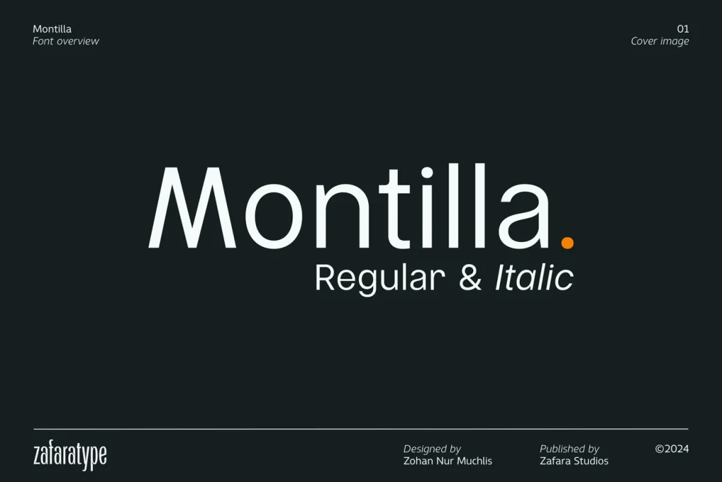
Montilla
Montilla gives you a clear, relatively unadorned starting point. The original cover uses a simple mixed-case word with regular and italic labels, showing a more straightforward direction than the decorative serifs elsewhere in the journal.
We would explore it for a small studio, a practical product range or a service business that wants its name to feel easy to approach. Compare the word in mixed case and capitals before adding a symbol. If the letters already provide a recognisable rhythm, the rest of the layout can stay quiet.
- Use it for
- Straightforward wordmarks, a clean product heading and simple brand stationery.
- Keep in mind
- A calm font does not remove the need for spacing adjustments. Check wide and narrow neighbours in the exact name rather than adding the same extra gap between every letter.

02 / Let the open space be part of the design
Quick
Quick’s main specimen uses very light, open forms and generous spacing. It offers a quieter, airier look when the name can remain fairly large and the identity has room for a simple arrangement.
Try this direction for a photographer’s card, a considered lifestyle label or a short studio name. The listing shows light, regular and bold styles with italic companions, so compare a sturdier weight for small supporting text rather than using the cover’s thinnest treatment everywhere.
- Use it for
- Spacious wordmarks, restrained stationery and short display names with a lighter mood.
- Keep in mind
- Thin strokes and wide spacing can lose presence on a tiny label. Test a heavier style or reserve the light treatment for larger uses if the smallest version becomes faint.
03 / A different kind of proportion
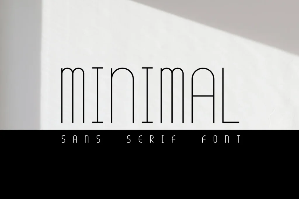
Minimal
Minimal makes the collection narrower and taller. Its slim shapes create a recognisable silhouette, which is useful when the proportion of the letters should carry more personality than a decorative terminal or swash.
We would explore it for a short name on a vertical tag or a simple editorial heading. Start with ordinary spacing and compare the full word. A narrow font can help a longer name fit, but stretching the letters or adding excessive gaps would undo the rhythm that makes it interesting.
- Use it for
- Vertical tags, tall display names and a compact heading on simple packaging.
- Keep in mind
- Very narrow letters need a readability check. Look especially at repeated vertical strokes and unfamiliar names, and use a plainer supporting face for longer explanations.
04 / Simple without feeling severe
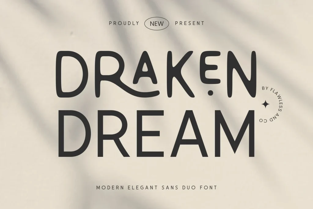
Draken Dream
Draken Dream takes a softer route. The slightly irregular, rounded shapes in the cover make the name feel more personal than a strictly uniform geometric wordmark, while the overall design can still remain spare.
Try it for a small lifestyle shop or a friendly product range with one clear name and a single accent colour. Compare the listed regular and smooth styles before choosing the main treatment. Keep the label’s practical information in a supporting style that is easy to scan.
- Use it for
- Friendly small-brand names, relaxed lifestyle labels and simple headings with a warmer voice.
- Keep in mind
- A softer display alphabet is still a specific stylistic choice. Check the characters in your name and the smallest version instead of treating it as a neutral font for every line of text.
Make the choice useful
Let the actual spelling make the decision.
Before downloading: compare the real business name.
Open a listing through the font’s button above and find “Try this font” on Creative Fabrica. Enter the full name, including punctuation and accents, where that field is available. Compare the available weights shown on the listing; otherwise inspect the specimen and glyph chart.
After downloading: check three real uses.
Install the font and build a simple wordmark in your design application. Compare it on your smallest label, a social profile image and a larger sign. Judge the same name at each size before choosing extra spacing, a thinner weight or an unusual case treatment.
Choose the supporting text as well.
Add a product description or contact line beneath the name. It should remain readable without borrowing the wordmark’s most delicate or unusual treatment. A small, consistent type system is more useful than a name that only works by itself on an empty page.
The images are the designers’ original product previews. Project and styling suggestions are our editorial ideas. Check the original listing for the available characters, current offer and license.
Back to the shortlist